
The Maples | Collateral Material


About Project
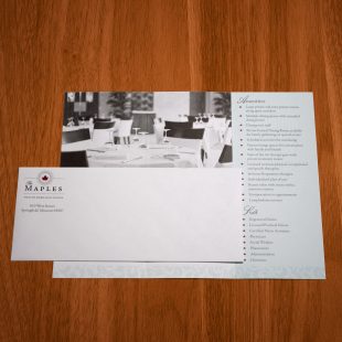
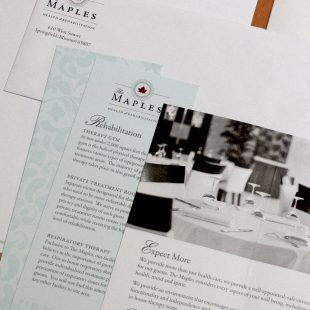
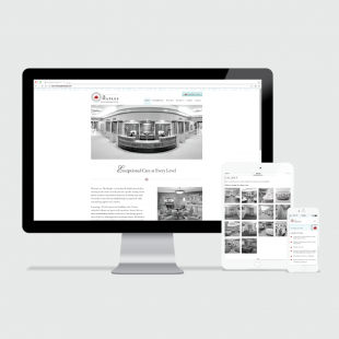
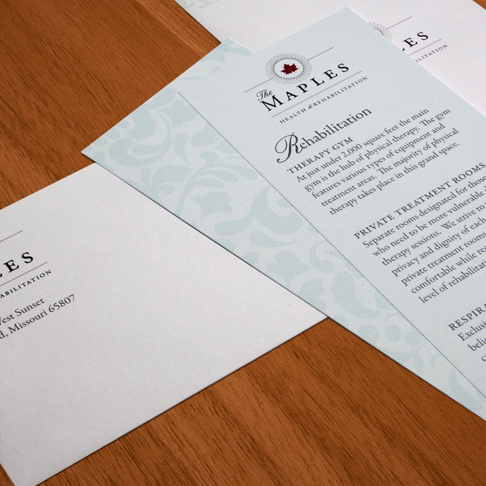
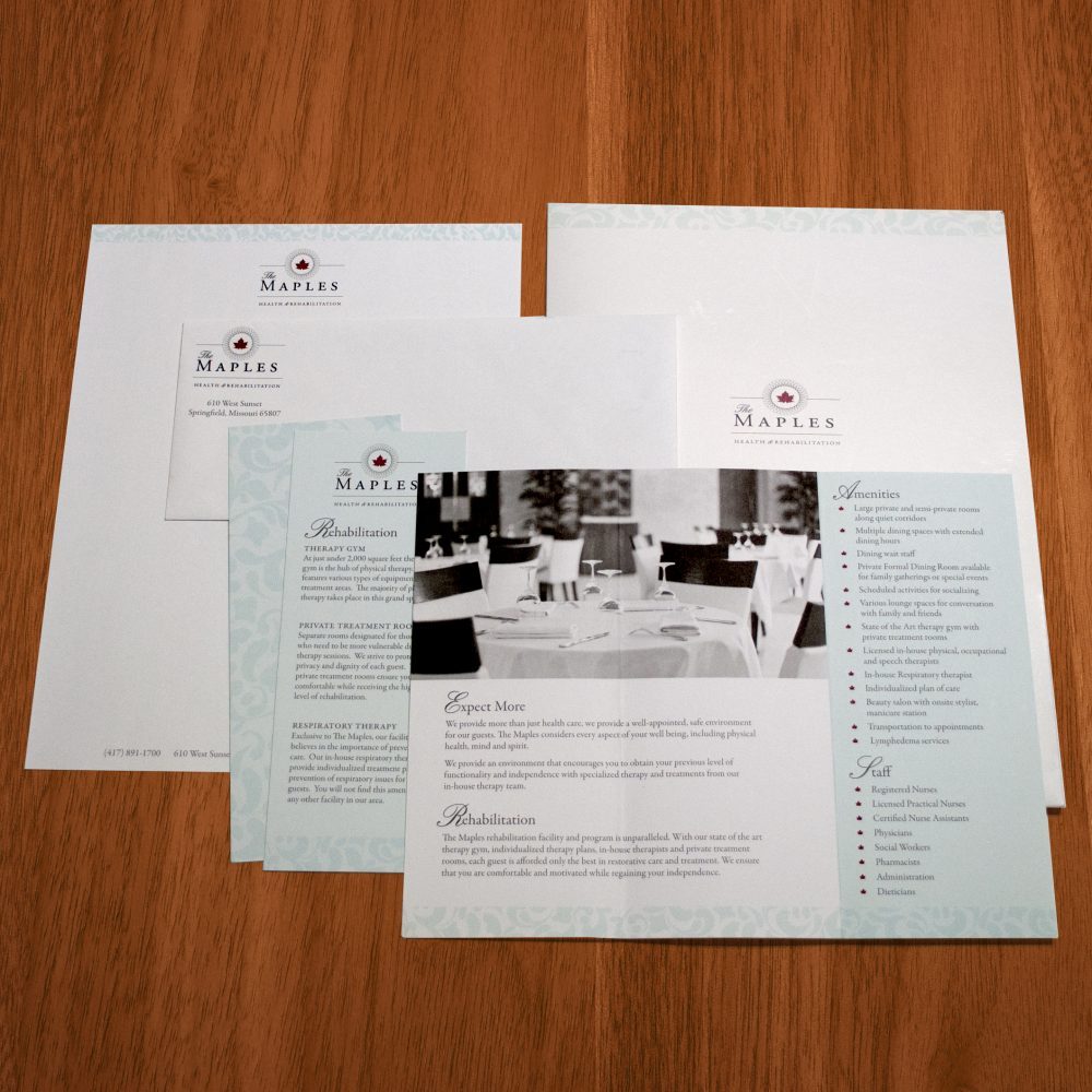
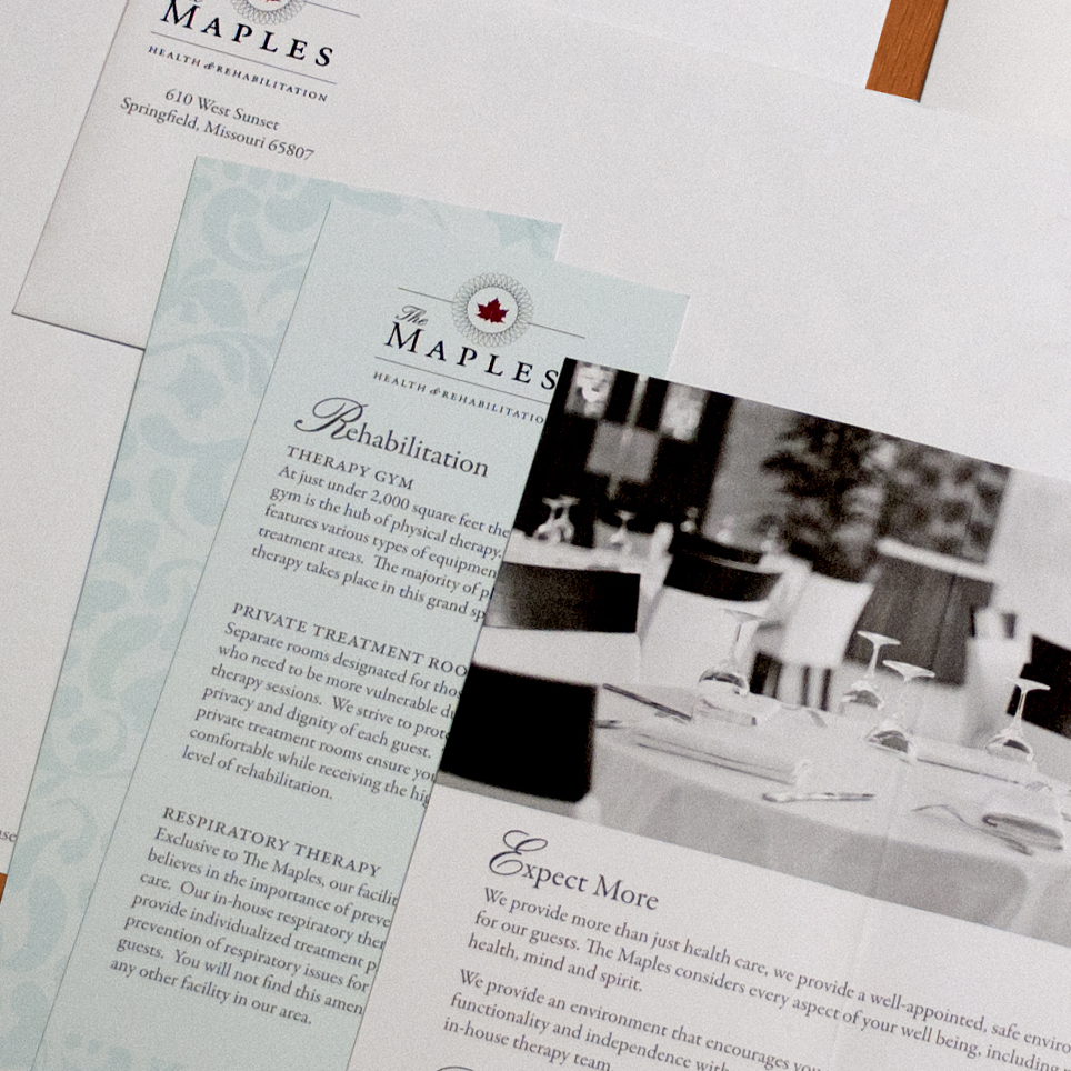
Recently revitalized, The Maples came to Sugar when they needed a new look to reflect the changes in their health and rehabilitation facility. We saw how special The Maples was and designed a brand that conveys its high quality and resort-like feel, and collateral materials to match. On top of the business cards, envelopes, and a website, we got to make them some really cool printed materials. Between pocketed folders, tri fold pamphlets, and price cards, this large project really shows how important getting the branding right from the beginning is!
Project Details
Date: 2015
Client: Christian Health and Rehabilitation
Scope: Branding, Print, Web