The Maples | Collateral Material
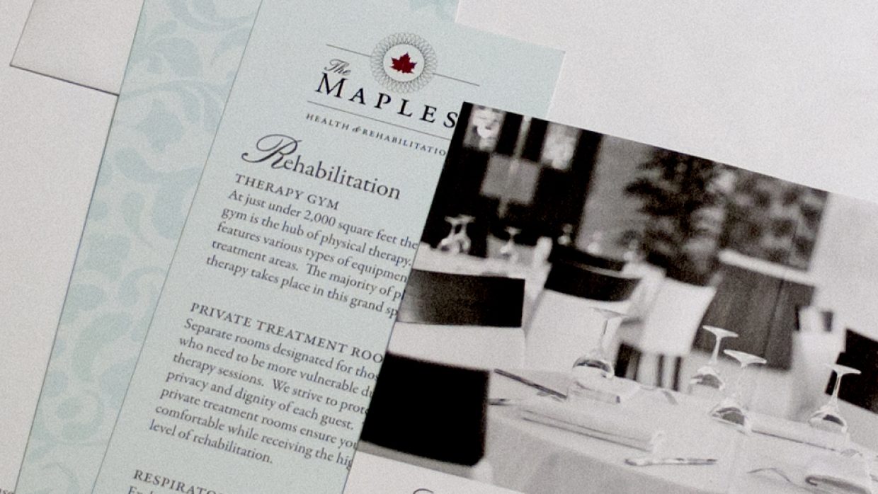
Recently revitalized, The Maples came to Sugar when they needed a new look to reflect the changes in their health and rehabilitation facility. We saw how special The Maples was and designed a brand that conveys its high quality and resort-like feel, and collateral materials to match. On top of the business cards, envelopes, and a website, we got to make them some really cool printed materials. Between pocketed folders, tri fold pamphlets, and price cards, this large project really shows how important getting the branding right from the beginning is!
Date: 2015
Client: Christian Health and Rehabilitation
Scope: Branding, Print, Web
Galloway Grill | Restaurant Branding
The owner of Galloway Grill is an entrepreneur with a lot of passion for his restaurant. When Galloway Grill moved to its current railroad-side location, we helped him renew this former tavern and pool room’s brand to fit its new location and friendly saloon style. We added just enough distress so that the feel is rustic but not run down, reflecting the restaurant’s “come as you are” attitude. We paired it with the perfect color palette to remind customers that they’re taking part in Springfield’s history when they sit down to a meal at Galloway Grill.
Date: 2013
Client: Galloway Grill
Scope: Branding, Print, Web
Visit website
City Butcher | Brand Identity
When the owners of City Butcher opened their dream restaurant in 2014, they needed a strong brand identity. To tell the story of what their artisan butcher shop and eatery was all about, we went for a design that is as simple and clean as their legendary barbecue. We added versatile elements to reflect a brand that serves many purposes.
In 2016, City Butcher expanded to a downtown location called CB Social House. For this expansion’s brand identity, we focused on conveying a the higher-end dining experience. It’s become one of Springfield’s hottest culinary locations. CB Social House is conjoined with the City Butcher Downtown Market, a full service butcher.
Date: 2014
Client: City Butcher
Scope: Branding, Print, Packaging
Crative | Umbrella Brand
This out-of-the-box entrepreneur client needed an umbrella brand that would tie together his product lines: Holiday MooseMugs, MadChef, and MyTrendz knitting kits. We focused on his concept of fun and adventure in a crate that ships to the customer’s door, and landed on the concept of Crative: Creativity in a Crate. Crative kits challenge customers to pick up a new skill and make their own magic. With the slogan in mind “We’ve thought of everything inside the box so you can think outside of it”, we created a brand that is as fun and innovative as the ideas of our client.
Date: 2015 – continuing
Client: Crative
Scope: Branding, Print, Packaging
PC Net | Website Update
PCNet’s mission is to make business owners who aren’t up-to-date with the latest technology comfortable buying technical services. We’ve been working with PC Net for years, on their logo and branding, collateral, and website. To help them achieve this, we focused on making things easy for the end user. A friendly and fresh website update helped create an exposure point that’s simplified and functional. We used clean graphics and plain, clear language to ensure PCNet’s customers they’re getting exactly what they need.
Date: 2014 – 2016
Client: PC Net
Scope: Branding, Packaging, Print, Web
Their Website
Don Wessel Honda | Brand Refresh
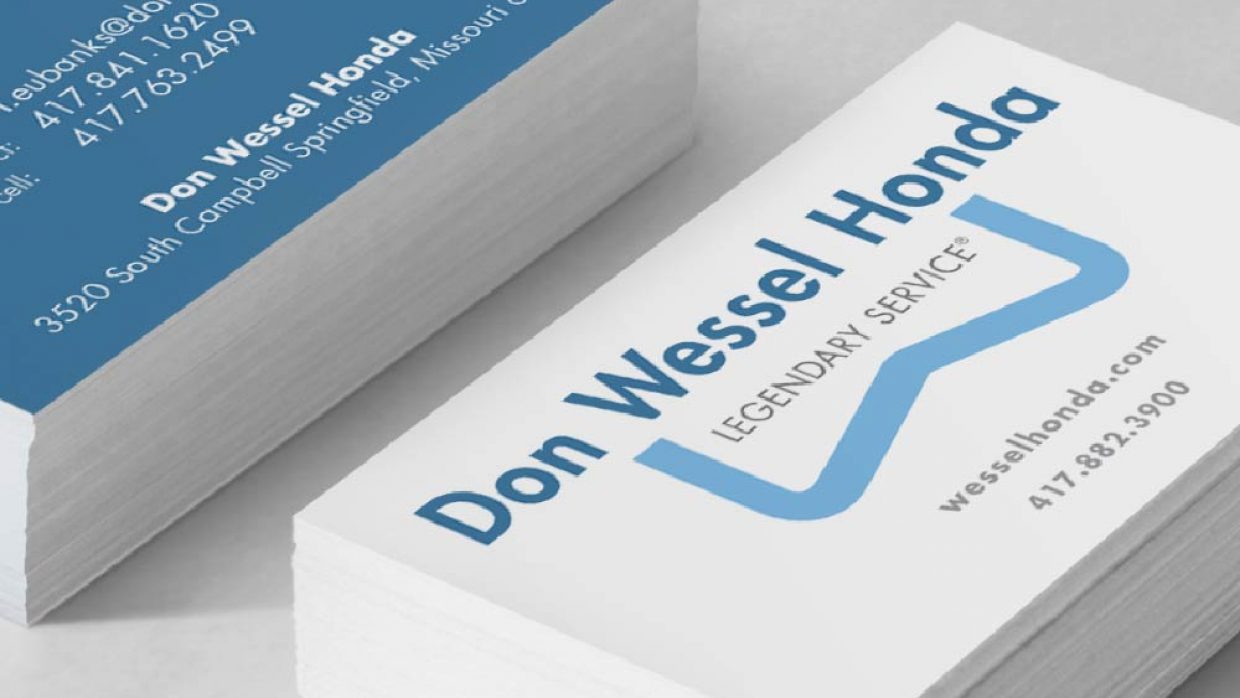
After 50 years as Springfield’s Honda dealership, Don Wessel was ready to rebuild their brand. We took a cue from their already strong message of legendary service. A new icon that matches their “blue ribbon” quality and incorporates the letter “W” reflects the dealership’s solid reputation and lasting legacy. We were guided by a fresh, clean design that updated their look for everything from their car tags to their billboards.
Date: 2014 – continuing
Client: Don Wessel Honda
Scope: Branding, Print
Landau Boats | Layout Design
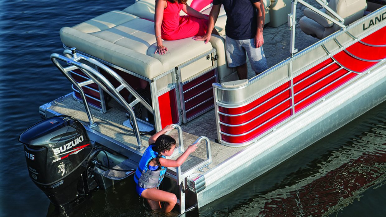
We’ve had the pleasure of working closely with Landau for a quite a few years. In each project, we strive to demonstrate the nature of what it means to own a Landau boat. The key factor in this brand is first and foremost, quality. This is reflected in the sophisticated layout design of their annual catalog, as well as in the clean function of their website.
Date: 2012 – continuing
Client: Landau Boats
Scope: Print, Web
Their Website
FASCO | Promotional Material
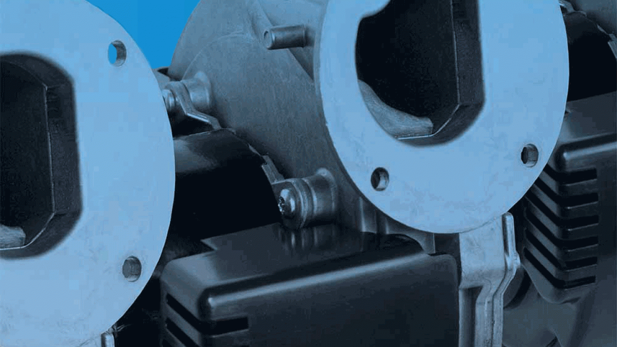
Fasco, a company that designs and manufacturers AC motors and blowers, needed a booth for a European trade show to help them expand their global presence. Our challenge with this project was to make their blowers larger-than-life – something that would stand out from the crowd. We accomplished this with a 12-foot banner featuring their blower with their striking signature blue for the backdrop. This impressive display was visible from all sides of the showroom floor.
Date: 2011 – 2014
Client: FASCO
Scope: Branding, Print
Pointe Seven | Branding, Website, and Print Materials
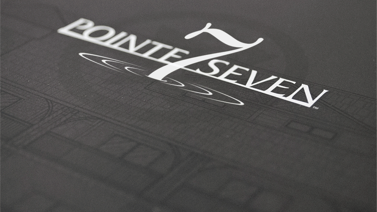
Our branding for Pointe 7, a series of Branson-area lakeside homes, was created with an aesthetic to the majestic quality of living that consumers are sure to find there. We’ve carried this elegance on through a number of print materials and web design for the brand, capturing the essence of a vacation and a home all in one.
Date: 2006 – continuing
Client: Pointe Seven
Scope: Branding, Print, Web
Their Website
